How to Make a Seamless Instagram Carousel (Without Photoshop)
A seamless carousel is one wide image cut into slides, not a set of matching posts. Here's the canvas math, the gotchas Instagram adds, and the fastest way to build one.
August 10, 2026 · 3 min read
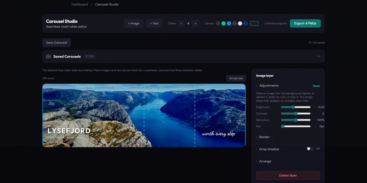
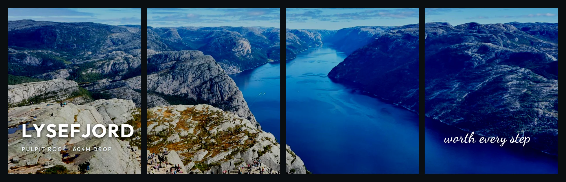
You’ve seen the carousels where one photo runs across every slide. Swipe, and the ridge line keeps going. Swipe again, still going.
So you try it. You cut a photo into four pieces in whatever editor is already open, upload them in order, and the seams don’t sit right. There’s a hairline of white on slide two and a jump of a few pixels on slide three. It reads as sloppy, which is the one thing this format can’t afford to be.
That’s not your eye failing. It’s a math problem, and it starts before you open an editor.
A seamless carousel is one canvas, not four posts
Most people get stuck by treating a carousel as four images that happen to line up at the edges.
That’s not how it works. It’s one wide image that gets cut at the very end.
Instagram’s tallest portrait slide is 1080 × 1350 pixels, a 4:5 frame. Four of those side by side make a single canvas 4320 pixels wide and 1350 tall. You design on that canvas. You run your photo across the whole thing. Only when you’re finished do you slice it into four 1080-pixel columns.
In that order the seams are exact, because they were never separate files to begin with.
Reverse it, cropping first and assembling later, and every slice inherits whatever rounding your editor did. A source image 4321 pixels wide divided by four gives you 1080.25 per slide. Something has to give, and what gives is the seam.
Why a quarter of a pixel is visible
Most editors won’t warn you. They’ll hand back four files at 1080 × 1350 and quietly drop a fractional column somewhere in the middle.
You won’t catch it on a laptop preview. You’ll catch it on a phone at full brightness, as a thin bright line where two slides meet. I’ve watched someone re-export the same carousel four times chasing that line, sure it was a compression artifact.
What Instagram does to your slides after upload
Instagram carousels stop at 20 slides. That’s the hard ceiling for anything built on one long image.
Three things happen on upload that change how a seamless design lands.
Instagram re-compresses everything. Upload at exactly 1080 pixels wide and there’s nothing left to resample. Go wider and it downscales, which softens fine detail in exactly the place you need it sharp.
The feed also shows a sliver of the next slide. Anything sitting hard against a slide edge competes with that swipe affordance, so keep the outer edges quiet.
And nobody ever sees two slides at once. That last point gets ignored constantly, and it’s the one that decides whether the carousel works.
Cross the boundaries with pictures, not words
A photo that runs across a seam works because the viewer rebuilds it from memory as they swipe. A headline that runs across a seam does not. They read “LYSEF”, then half a second later “JORD”, and the word never assembles.
So let imagery cross boundaries and keep type inside one slide.
Rules worth following
- Design at 1080 × 1350 per slide. Multiply by slide count for your canvas width, and nothing else.
- Export PNG, not JPEG. JPEG artifacts cluster along high-contrast edges, and a seam is a high-contrast edge by definition. This is the one people get wrong twice.
- Keep type off the seams. One thought per slide, with margin.
- Put the hook on slide one. Completion rates fall off hard after the second slide, so treat the panorama as the reward for swiping rather than the reason anyone starts.
- Check slide one and your last slide as standalone images. Slide one is what appears in your grid, and the last is what people sit on before they scroll away.
- Use fewer slides than you think. Four is plenty for a wide shot.
Doing this without design software
Carousel Studio takes the canvas-first approach and does the slicing for you. You get one continuous canvas spanning every slide, with dashed guides showing exactly where the cuts will land, so you can see a photo crossing a boundary while you’re placing it.
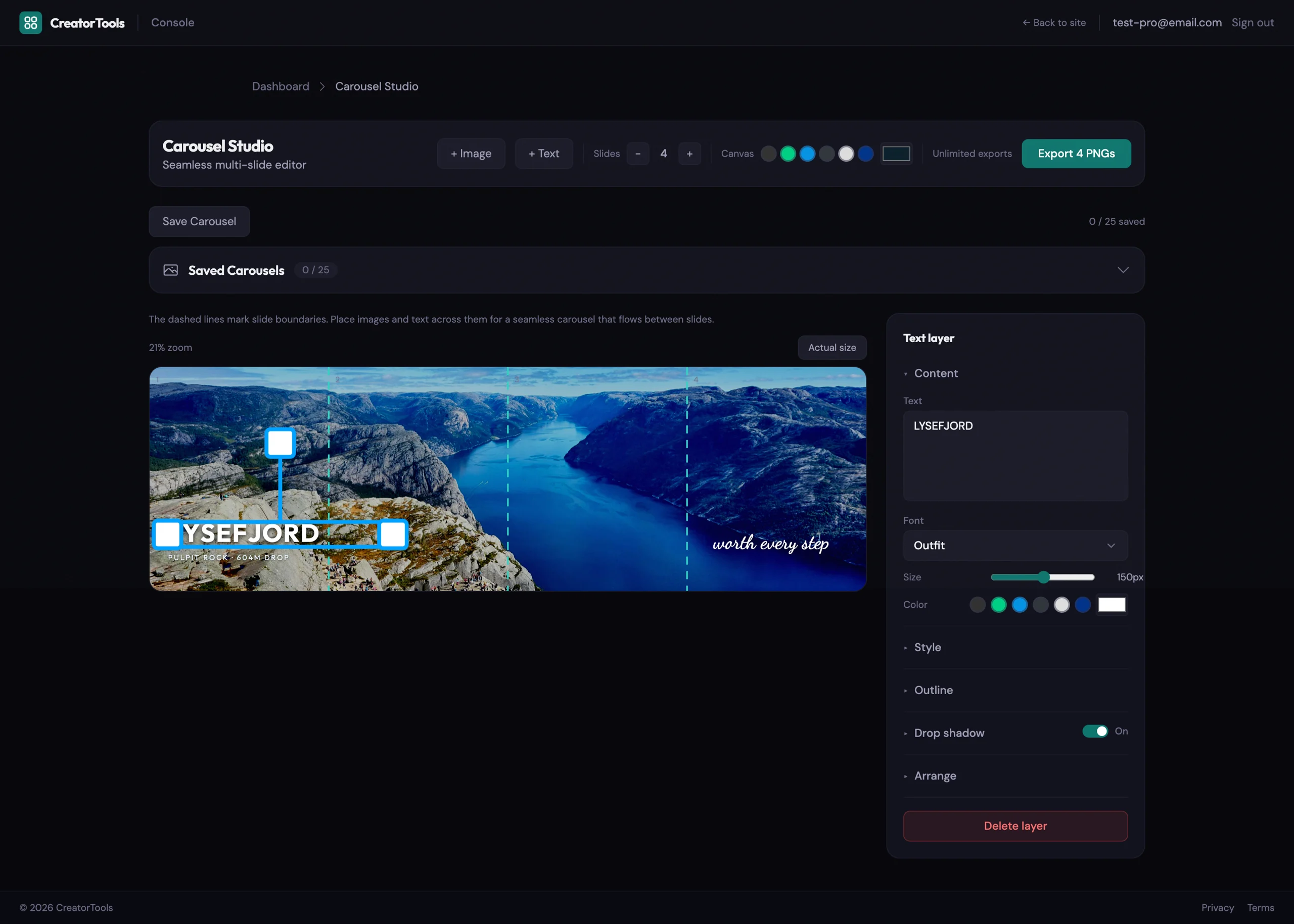
Drop in images and text, then drag, resize, and rotate them anywhere across the canvas:
- Image controls for brightness, contrast, saturation, blur, plus a border and a drop shadow.
- Text controls for nine fonts, size, color, bold, italic, alignment, letter spacing, line height, an outline, and a drop shadow.
- Brand colors from your Vibe Check profile show up as one-click swatches next to every color picker.
- Export gives you a single ZIP, slide-01.png through slide-NN.png, each one exactly 1080 × 1350, no watermark.
- Close the tab mid-edit and it offers your draft back when you return, images included.
Pro accounts can save up to 25 carousels to reload and keep editing later.
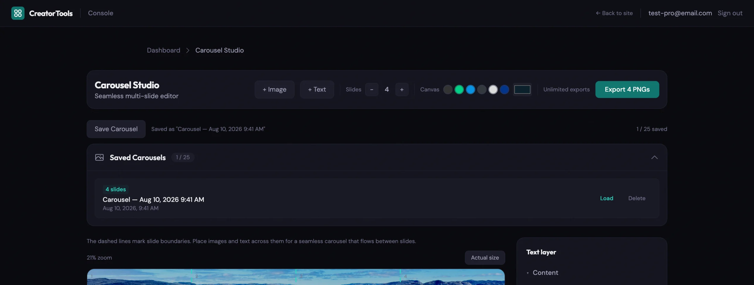
Without an account you get 3 slides and one free export at full quality. A free account raises that to 10 slides and 25 exports a month. Pro goes to all 20 slides with unlimited exports.
One note: this one wants a real screen. Dragging and resizing layers on a phone is genuinely awkward, and the editor will say so, though it won’t stop you.
No account required. No install. Just open it and start dragging.
Takeaway
Get the canvas right and the seams stop being something you fight.
What’s worth noticing is what happens after. Once slicing is automatic, seamless stops being a special project you set aside an evening for and starts being a layout you reach for, whether that’s a wide chart that needs room to breathe, a timeline, or a before-and-after that was never going to fit in one square.
The panorama is only the beginning. The extra width is what you’re really getting.